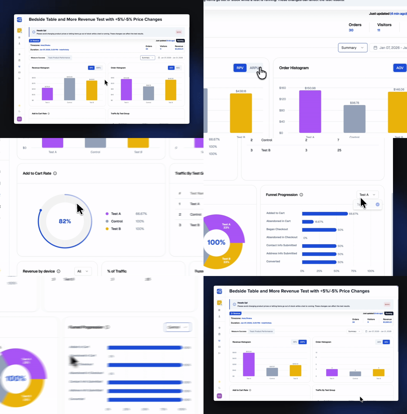
Summary View
The Summary tab gives you a high-level snapshot of how each test group performed. It’s the quickest way to evaluate overall experiment performance.

Revenue Histogram
A visual breakdown of revenue performance across test groups.
Includes:
- RPV (Revenue Per Visitor)
- ARPU (Average Revenue Per User)
Order Histogram
A comparison of order quality and purchasing behavior across variations.
Includes:
- AOV (Average Order Value)
- AOU (Average Order Units)
Add to Cart Rate
Shows how effectively each test group drives customers to add items to their cart — a key indicator of engagement and intent.
Traffic by Test Group
Displays how visitor traffic is distributed across your groups, helping you confirm whether traffic allocation is balanced as expected.
Traffic by Test Group
Shows the percentage of total visitors routed to each test group — useful for validating your traffic split settings.
Revenue by Device
Breaks down revenue generated by each device type (Desktop, Mobile, Tablet), so you can understand performance across different shopper behaviors.
Funnel Progression
Visualizes how each test group moves through critical funnel stages, such as:
- Added to Cart
- Abandoned in Cart
- Abandoned in Checkout
- Contact Info Submitted
- Address Info Submitted
- Converted
Perfect for diagnosing where one test group performs better — or where customers drop off.
TestSignal Team